
参考如下代码示例
<style>
        body,p,h1{
            padding: 0;
            margin: 0;
        }
        html,body{
            height: 100%;
            width: 100%;
        }
        html{
            height: 100%;
            width: 100%;
        }
        .div1{
            width: 100%;
            height: 100%;
            background-color: teal;
        }
        .div2{
            position: fixed;
            width: 300px;
            height: 400px;
            margin: auto;
            background-color: tomato;
            top: 0;
            left: 0;
            right: 0;
            bottom: 0;
        }
    </style>
<body>
    <div class="div1">
        <p class="div2">居中元素</p>
    </div>
</body>
运行效果
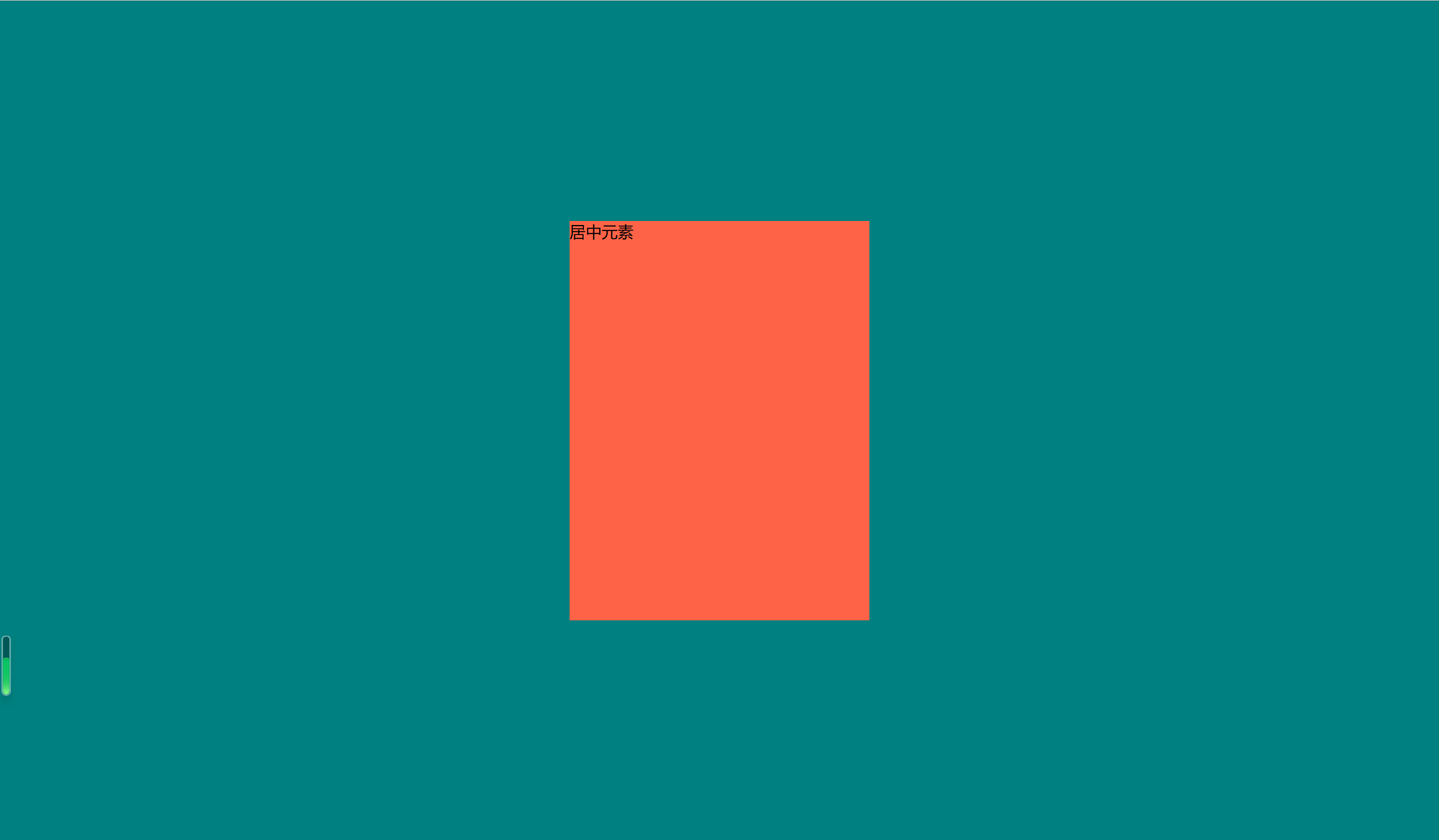
注意:其中position: fixed;是必须要加的,但是用absolute和relative也是可以的,但是一般情况下,添加的窗口是固定在屏幕的正中间,所以一般使用fixed
 AI助手
AI助手 资讯
资讯 常用工具
常用工具 网站模板
网站模板